Vorono
-
Posts
4 -
Joined
-
Last visited
Everything posted by Vorono
-
User Profile and Direct Messaging Improvements Beta
Vorono replied to JustThatKing's topic in Site Updates
Youtube has thumbnails with SOME info. The text is minimal compared to the mods thumbnails that provide both description text and info. There is just much more. In my personal opinion, I don't like youtube's layout, I always reduce my youtube tab so that at most 3 thumbnails are shown in the front-page. I use a 32" 4k monitor, so that would be the reason, but the most common monitor resolution is still 1920x1080 (most likely 27") based on steam charts. Also, the removal of the downvote button sort of ruins their integrity to focus on the UX, so I don't trust them to begin with -
User Profile and Direct Messaging Improvements Beta
Vorono replied to JustThatKing's topic in Site Updates
I disagree completely with this. "All the information from side to side as much as possible" is going to overwhelm people at an instant. This page is not meant for you, it's for people who download your mods. Those people are going to be less comfortable and used to these pages, and will definitely be overwhelmed in an instant. There is a reason no professional website actually fills their window like you want to. It's worse for 95% of the people who are going to view the page. Whitespace is not just "empty space", it is there because our screens are actually too big for the content we need. Have you ever tried reading a book the size of a wall? It's worse than a A5 page, for a good reason. -
User Profile and Direct Messaging Improvements Beta
Vorono replied to JustThatKing's topic in Site Updates
Do they really have to have the speicifc dates on the preview tiles like those? Once you click on the mod tile you get your full infomration there. Honestly it's fine the way it is now, with the approximate dates (3 months ago etc). I find that more useful. Your follow up comment about how lacking of information it is, is also a bit misguided, since the point of those tiles is to preview the mods the user has, not to have the entire mod page in one tile. The info is still going to be there once you click on it. It's not that much different from the original one. On the other comment about size I agree. -
User Profile and Direct Messaging Improvements Beta
Vorono replied to JustThatKing's topic in Site Updates
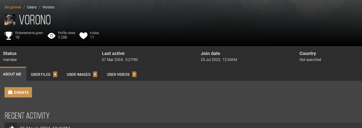
Hello, I want to give feedback, and although it might've been suggested already (I'm not going to read through 26 pages), I find the trend of making everything BIG just a huge mistake that targets only mobile phone UI/UX, and ignores completely the traditional monitor and keyboard UI/UX. Making everything too big makes everything too noisy - everything wants your attention, and my vision gets overwhelmed by the size of things. Keep things more compact. Human eyes/brains analyze rather than reads at first. I have added two mockups of suggestions to keep things a bit more compact. 1. You can see that I melded the information (endorsements, views, kudos) into one bar, because they are not buttons - the consitency is broken once you turn them into button shapes. 2. I placed the interactive buttons (message, kudos, donate, track) into more traditional layouts, and much more compact. When we analyze, we don't want to move our hand/eye too much when hunting for information. Having the clickable options very close helps us target and exectute faster. The second version utilizes what we are very used to already, with a horizontal layout. This layout can work and give more breathable space because it is horizontal - if it is spaced out too much vertically, it doesn't work anymore. 3. I moved the misc info (location, activity, joined), under the About Me section. It just makes more sense. 4. I offset the block and report buttons to stand out more, so that they are much easier to recognize and locate than the others, and that they are seperate from the more "positive" buttons - they are not supposed to be weighed the same as the other buttons. * I also would really like to customize what the first tab be. IMO having an option to set "Mods" as my first tab, rather than "About me". v1 v2 edit: v2.5: The pic is overrated, not that important compared to the name. Keep it in the about page. And to mention: sticking to the layout you already have is much more important than makign it more "friendly" to new people. Your current userbase is always going to be your largest demographic that is used to this: Compact. Information areas are not buttons. Although it is actually messy, it still has a base layout that should be improved uppon, rather than revamped compeltely. And I want to say that the new "Mods" tab is beautiful, those cards look very neat and are designed perfectly imo. I would perhaps add an overflow button as "manage" option for the owners of the profuile, for quick access.