Plagueofdeath
-
Posts
16 -
Joined
-
Last visited
Everything posted by Plagueofdeath
-
Community manager stated it was accidentally made free during website redesign
-
Yeah no it wasn't
-
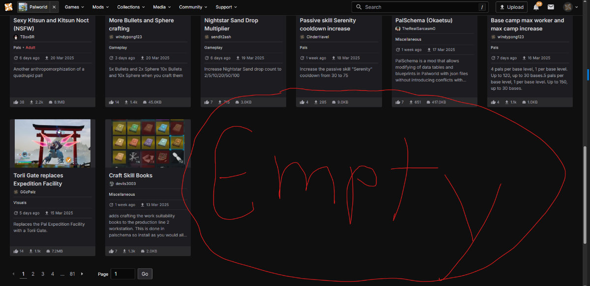
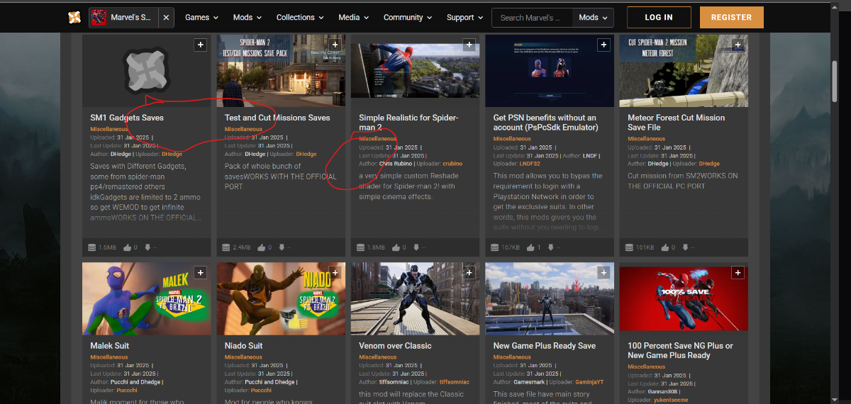
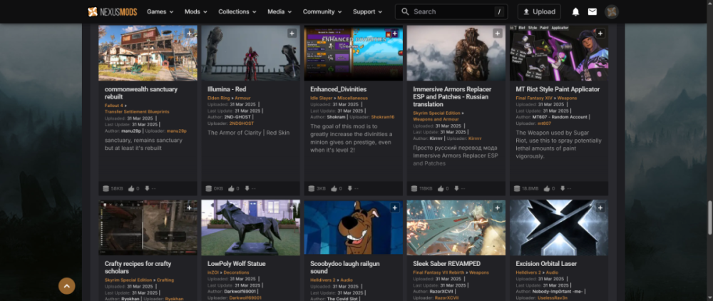
example of the bullshit coming from new ownership, this feature was free. now its behind a paywall to view more than 20 mods on one page

-
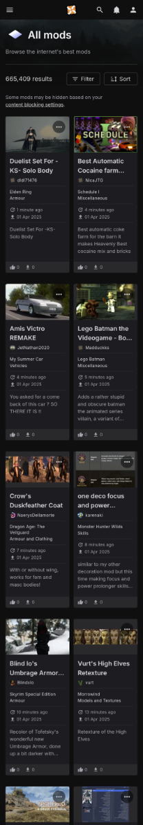
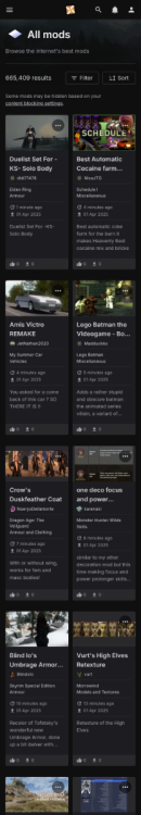
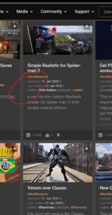
Going to keep asking until i get an answer, the words uploaded and update dates need to be added back. We shouldnt need to hover our mouse over every icon to see this text.
-
Why is the website design and layout literally catered to mobile users? You guys are a pc modding website.
-
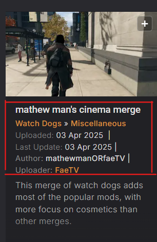
YEah i see that now. They need to re-add it back. This causes more confusion as i have no idea what an icon is supposed to mean. and now i have to do it for every mod
-
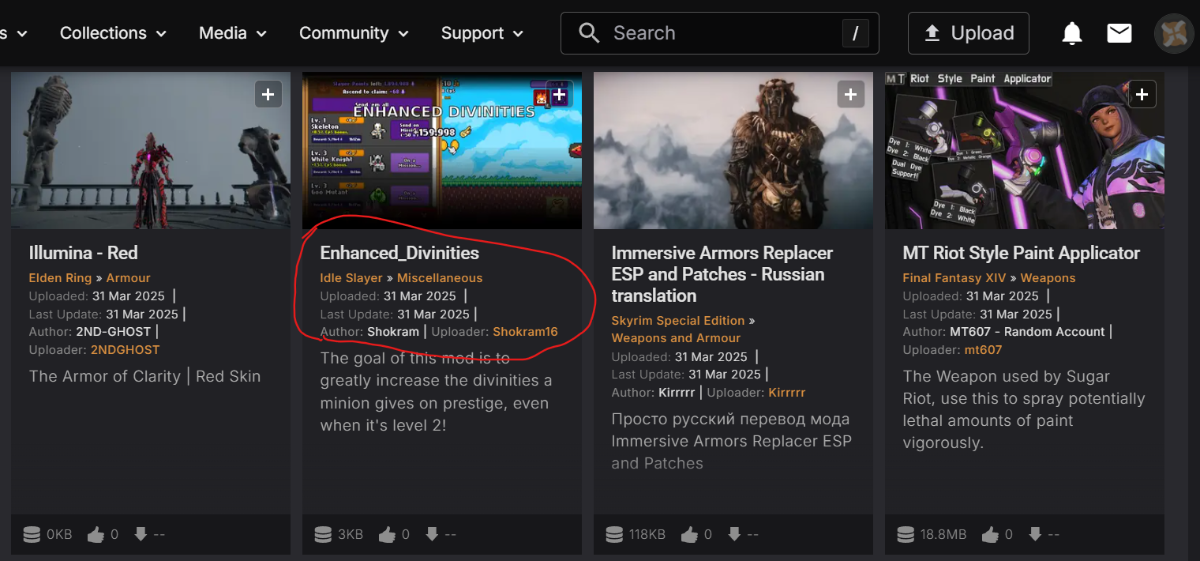
i have dyslexia and ADD why is the text showing who the author of a mod is gone. Along with the last uploaded and last updated. It seems these were replaced by symbols that Im somehow supposed to know what they mean? Its infuriating you guys claim to care about accessibility, but have removed basic info for people with mental and learning disabilities.

-
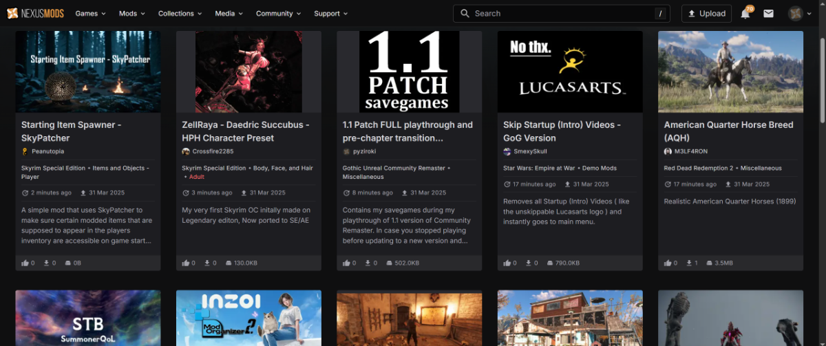
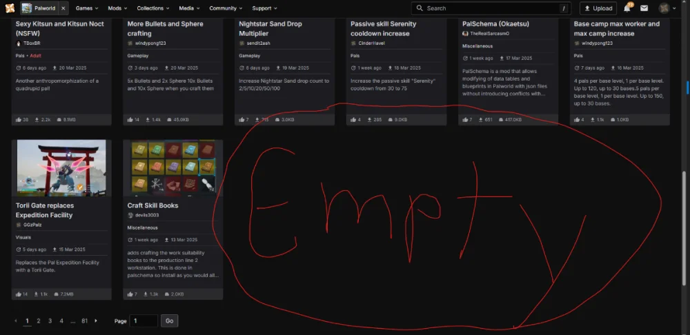
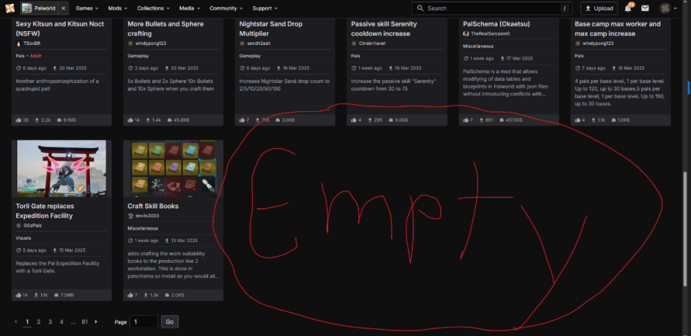
Website scaleability is off and needs fixed. These screenshots are from a ultrawide monitor. The fact that with the new ui looks like a mobile site on desktop site, can only see or browse 5 mods at a time just goes to show you guys put the mobile phone experience first over desktop usersbase. which is the only way any thing on your website can be installed. Your site and service does not support any kind of mods for mobile devices. The fact you put mobile expericence over desktop users base is mindblowing and negligent.

-
Would love a way to go back to the old UI, even if it never gets updated with new features 100 percent with ya on this. Im in my late 20s and stand with the moto if it aint broke dont mess with it. Especially because its like riding a bike or driving a car with muscle memory. New design and removing features is harder the older ya get.
-
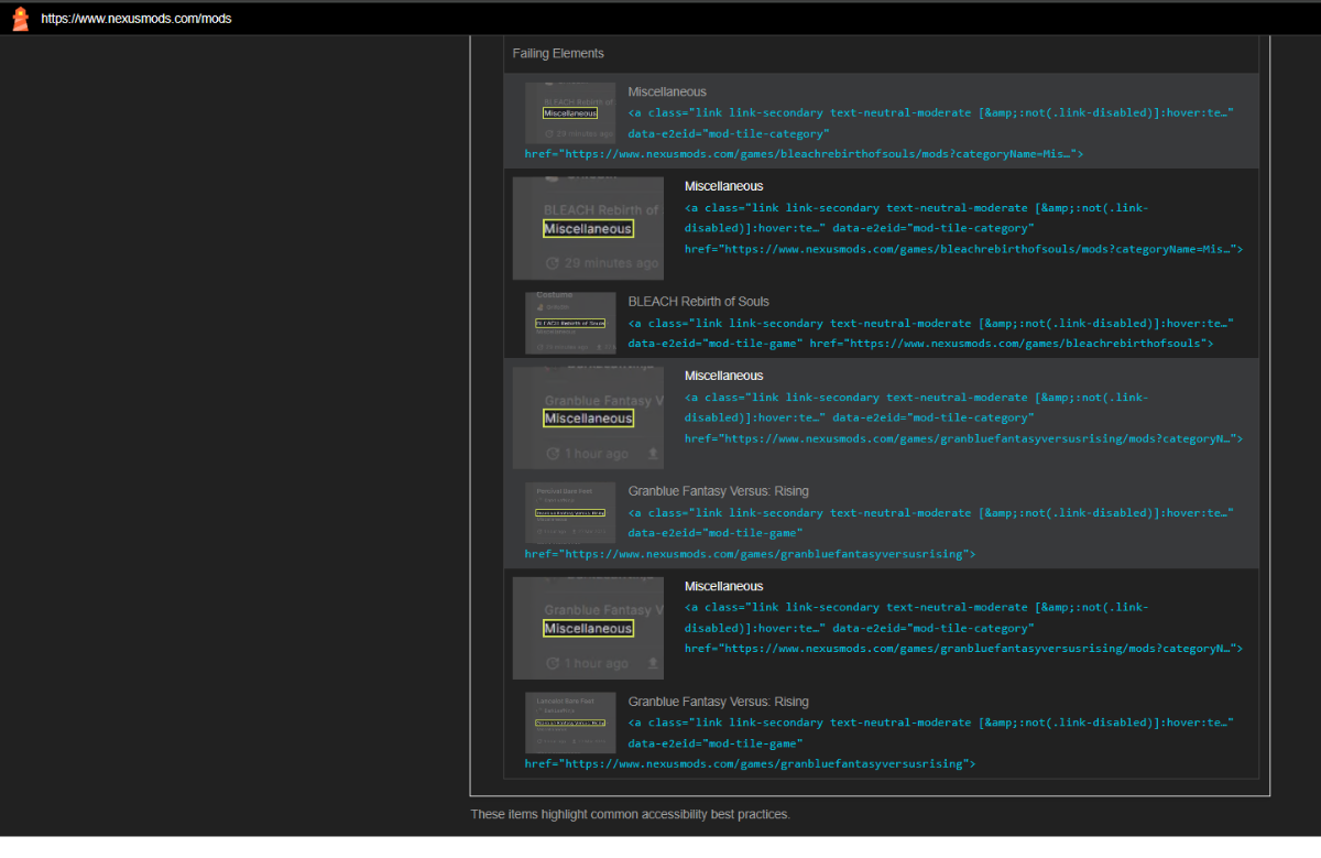
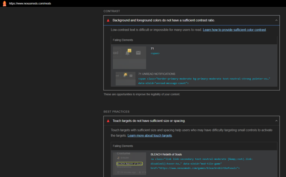
Google Chrome analysis of what you guys need to work on also

-
I agree, there are a few places that have been started up though in fairness. But nexusmods basiclly has a monoploy from being around so long. Which is why ive pointed out that people who pay monthly premium need to vote with their wallet. Since thats the only real way we can maybe make a difference
-
Yeah i wasnt sure if this is how it was or not. The old ui had dates with titles showing last uploaded and updated dates. This is confusing as hell. At this point I think they broke the website on purpose so they could actually have work to do, especially with no actual fixes yet or options. The staff will want a big pat on the back after they re-add features they took away from us.
-
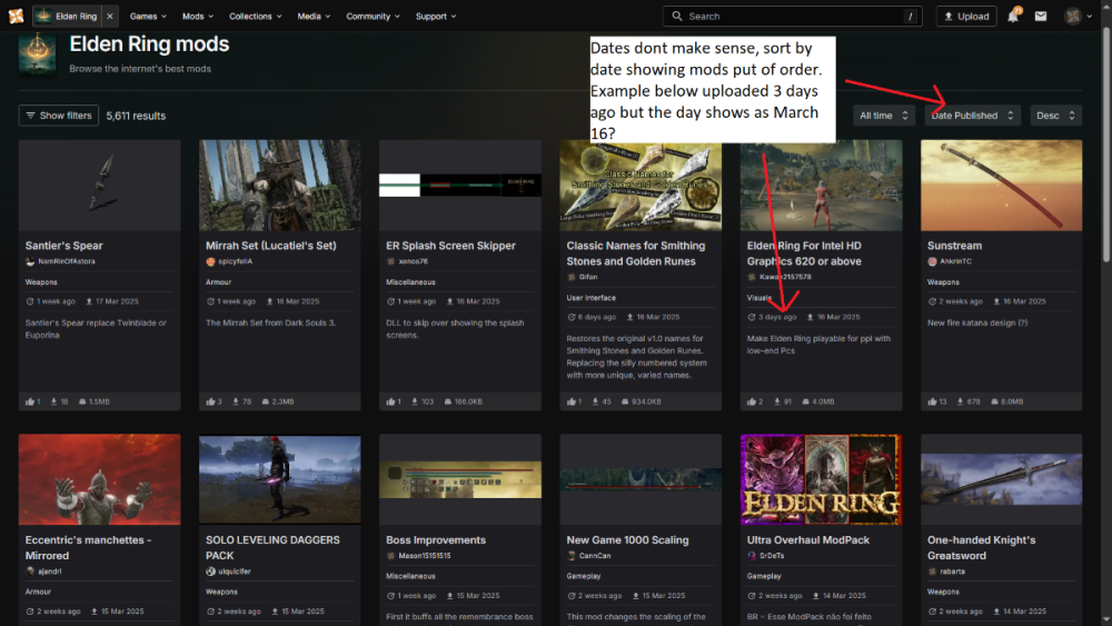
Also sort by dates not working properly and showing uploading on wrong date.
-
This stylus mod looks way better good job. It honestly makes me think that the website changes were made while looking at it on a uncalibrated monitor.
-
Yes I am. The hyperlinks being orange help filter out titles and other text.
-
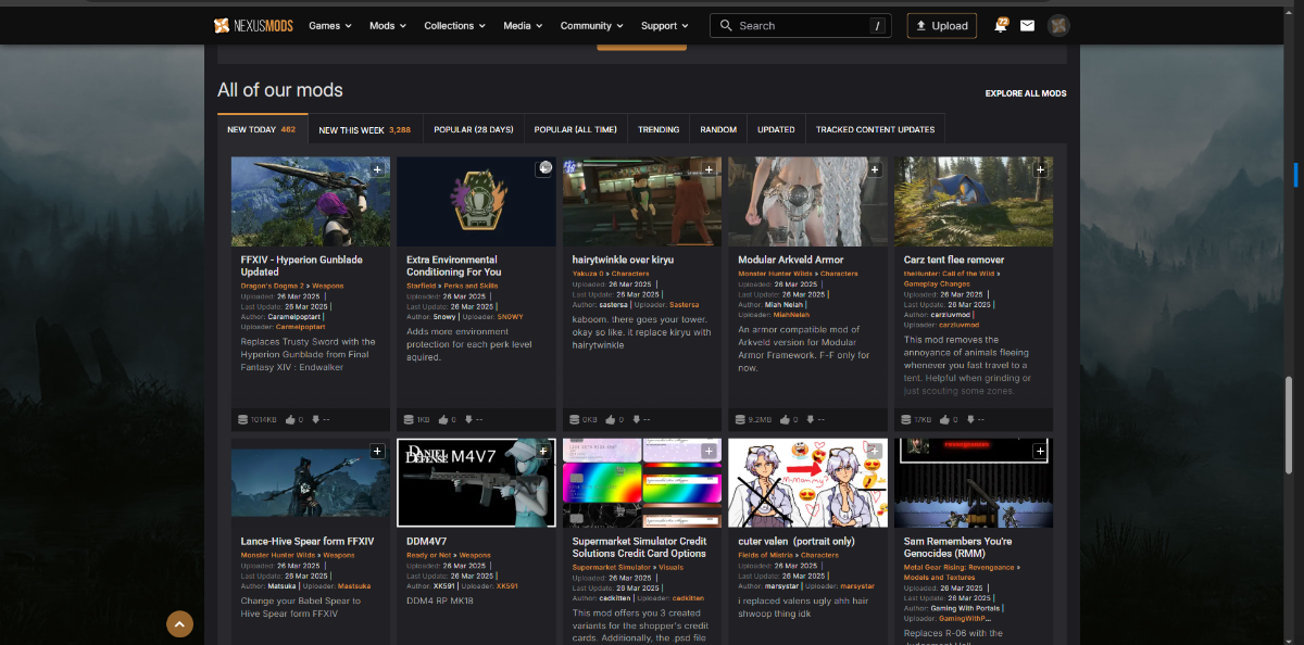
Bring the orange colors back to separate the bland text. Single text color makes it look like one paragraph column
-
More wasted Space. And the home page still has the old look we all want to come back. Thats odd, yet we get told it isnt possible

- 205 replies
-
- 12
-

-
Gonna throw my opinion in with website being to dark now and hard to focus on reading. Im partly color blind and have ADD. On top of the site being to dark to differentiate text from things like titles of a mod to the description. The color removed from hyperlinks of these type of things makes it confusing as to what im reading. Along with the dang tiles of mods are half the dang screen length now. So much space is being wasted with this UI overhaul. It looks like a crappy mobile website ui.

-
new ui filter being off to the side is trash compared to how it was on the top. looks like poorly designed mobile webpage now. Then certain games have the old UI still, so its not even consistent. Only way theyll make a change to this is if people cancel premium. Which ill be doing until its fixed