-
Posts
28 -
Joined
-
Last visited
Nexus Mods Profile
About mfPixel

Profile Fields
-
Staff Role
Design Team Lead
Recent Profile Visitors
The recent visitors block is disabled and is not being shown to other users.
mfPixel's Achievements
Contributor (5/14)
25
Reputation
-
-
If I understand you correctly, do you mean your search preferences in settings don't match the search results? If so, we're pushing an update soon to fix that — your sorting preferences will carry through to the quick search and full search results.
-
Thanks for the feedback - we totally understand that this is a big change and jarring for long term users. When you say "I had to spend 20 minutes refinding everything so I could use it." — what would be the biggest thing that caused issues for you when using the design for the first time? Anything in particular that stood out?
-
@xRay4004 can you explain in a more detail what you mean here pls. Do you mean on the quick search, or the mods listing page?
-
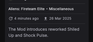
Hey @deadhitter1, thanks for the feedback. Can you show us where the sorting is broken pls? We've had a couple of people thinking the 'updated' date on the mod tile (in the image below) is the 'uploaded date'. When you're sorting by 'Last updated', it should be sorting by the date on the left (ie 4 minutes ago).
-
Respectfully, it's quite the opposite. We really appreciate focused criticism as it's easier to action if needed. For example, saying "I don't like it", or "It's ugly" is fine and a completely valid opinion, but it's more helpful to us If you can point to something specific you find harder to do. We've read all the responses in this thread and there are many improvements we want to make — with this update we're in a much better place to make incremental refinements more quickly.
-
Always appreciate constructive feedback. We worked with a talented freelance brand designer for these identity elements — we liked the visual effect of the line break, but appreciate this breaks a few rules. Now you've pointed out the 'ew', I can't un-see that! FWIW my team will tell you I have a real hatred for 'widows' and 'orphans' — something that is insanely hard to control across all screen sizes Glad you like the purple BTW.
-
Great catch, I'll log this with the team tomorrow.
-
Hey @chefsbrian, I'm sorry this is the impression you've got. We're a small team returning from the weekend, hence a bit less comms on this thread. We've been reviewing and logging all the feedback so far, I'm happy to discuss any specific issues you have.
-
That text size is incredibly small and not easy to read/accessible for visually impaired people. Increasing the text size to something legible makes it harder to handle all the meta-data while maintaining a balanced hierarchy. If you're used to this view, it'll seem easy to read, but for newer users, its a lot of info to take in. FWIW we're exploring further options for more compact/simpler tile views and we'll continue to tweak this layout. This is a great example of some UI that is seemingly simple but tricky to nail within the existing constraints. Thanks for the feedback though!
-
We'll sort this - that shouldn't be happening.
-
These tiles are particularly challenging to design for and keep all of the existing meta-data in place. We could explicitly add the labels "Updated" and "Uploaded" in, but that would be yet more text. As for the format being "time since" vs "actual date", there are pros and cons for both. Time since makes it quicker to establish how long ago the update has taken place, but you lose the exact date the longer time has passed. We'll continue to refine these tiles as we move forward — thanks for the feedback.
-
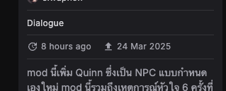
Hey @DefenestratedKoala , the dates on the mod tile are for "Updated" and "Published" (if you hover over the dates you'll get a tooltip clarifying). When you sort by published, it's sorting by the second, exact date. This should always be in sequential order. Older mods might have a newer updated date, resulting in the updated dates not always being in order. Does this make sense?
-
Great - glad it's sorted
-
Hey @DanishPagan, this should only be displaying 6 mods per row. Can you let me know what device, browser and operating system you're using and if you have any zoom settings or plug-ins running in your browser. Thanks


