Dragoneer2453
-
Posts
1 -
Joined
-
Last visited
About Dragoneer2453

Dragoneer2453's Achievements
")
Newbie (1/14)
0
Reputation
-
I swear the only remotely good thing about the new UI is the massive list of search filters. Everything else about it is awful: more dead space, physically larger items, less information per item (less space for title and description when browsing). Whoever designed it and whoever approved the design should be replaced, because they made a UI for a minority of users that, if other forum posts are accurate, have the same issues as the majority of the userbase.
-
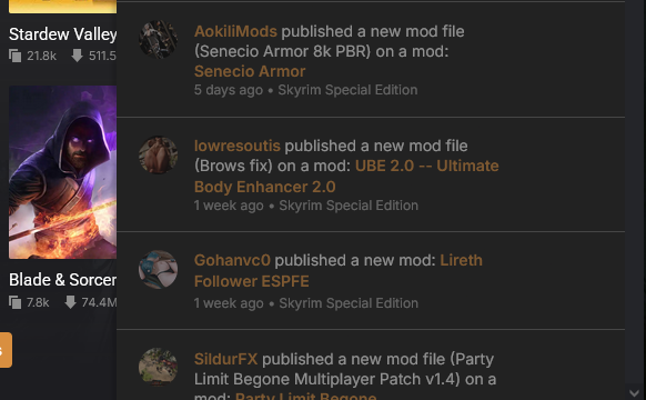
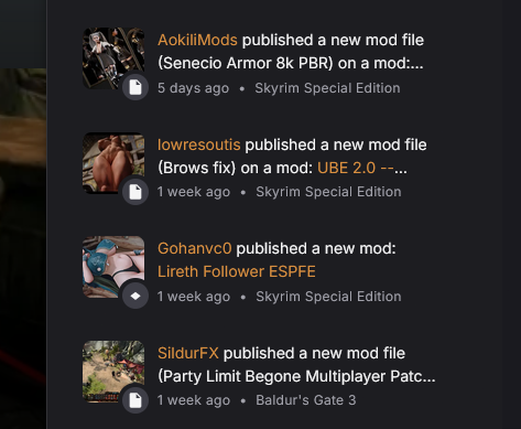
Not sure if it has been mentioned/noticed, but with the new site design (which is ugly and unappealing, I installed an extension for Youtube when they did a similar thing there to fix what could be fixed) notifications don't display the entire text. Also under the new design, mods now show less of their description in the preview when searching, despite taking more screen space. How do you make everything take more space but show less information, and call that "good"?