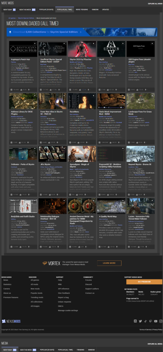
Okay let's Compare just the main page of SSE.
New Vs Old.
These are my Opinions viewed at 1920x1080 Resolution downscaled from a native 2560x1440 monitor on the Microsoft Edge browser with no Extensions/Addons logged out of my account on Nexus.
Pros;
Can see the # of Mods, Collections, and Media right at the top.
Larger Images for Trending Mods 3+ , Named "Trending Mods" instead of "Hot Mods"
Collections Now show the most popular ones instead of a Banner
More mods tabs have a small icon next to them.
Mod previews and descriptions are Larger.
Extra tabs made redundant with being able to choose time frame without going into /mods Page.
More Mods and Media look like they're part of the main page instead of a separate box module.
Footer has Manage Cookie Settings.
Cons;
Top bar is now Elongated with Nexus - Support being on the left side, and Search - Register (User Profile) being on the right side Vs being centered closer to the Middle.
1/3 of the Site is still empty space on the sides.
Lack of Background on the sides. (Can have the normal background gradiate into the blur as you scroll down)
Complete loss of the signature Nexus Orange on everything besides the Logo icon, Register button (Upload outline), Go Premium button, and Full NexusMods Logo
Cannot see Trending mod 3+ without scrolling down with Ads.
Only 2 Collections shown, always the most popular. Quite a bit of empty space between Trending and Mods.
Random being renamed to Surprise. (This isn't a lootbox you need to sell)
Loss of Tracked Content Updates
Mods listed are 4x4 compared to 5x4 (Can currently fit 6 per row with the negative side space)
Media images are not Resized
Site News lost the small Category tag on the top of the Article.
Vortex advertisement is gone.
Longer to load page. 0.291s vs 0.114s (Variable)
There are some good ideas and some bad. I mean The Main Homepage Hasn't gone under the same UI change yet.
In my Opinion this needs some more time cooking in the Kitchen.


")