I'd like to add to other that have pointed out the ability to hide the collections section. I never use collections (To much of a mod control freak, lol) and would like the space back for my browsing. The page already has a LOT of wasted space.
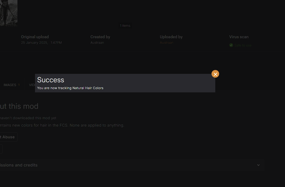
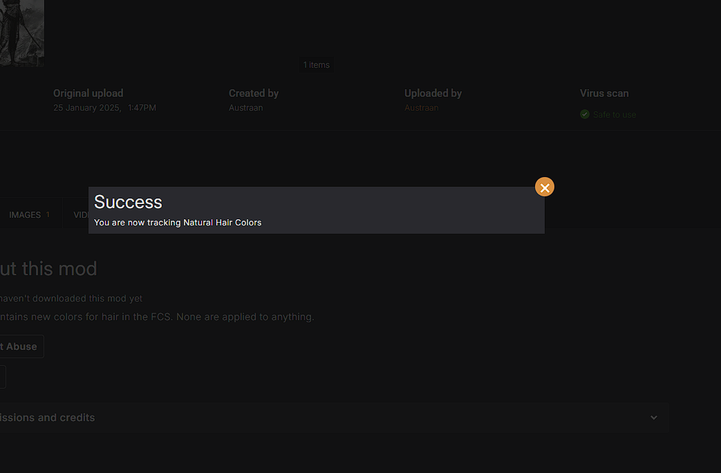
One other thing, as with the old page, the beta site does the same thing. Allow me to click anywhere to close the popup when I track a mod. It's such a small thing but it just erks me that you have to click the "x" to make it go away. Below is a screenshot of the offending little box.
I don't mind the new site, but I have to say I still prefer the old one (nostalgia, stubbornness? You choose). I do understand the need for an update. It's been a looooong time coming. However, I think it could be a little more compact.