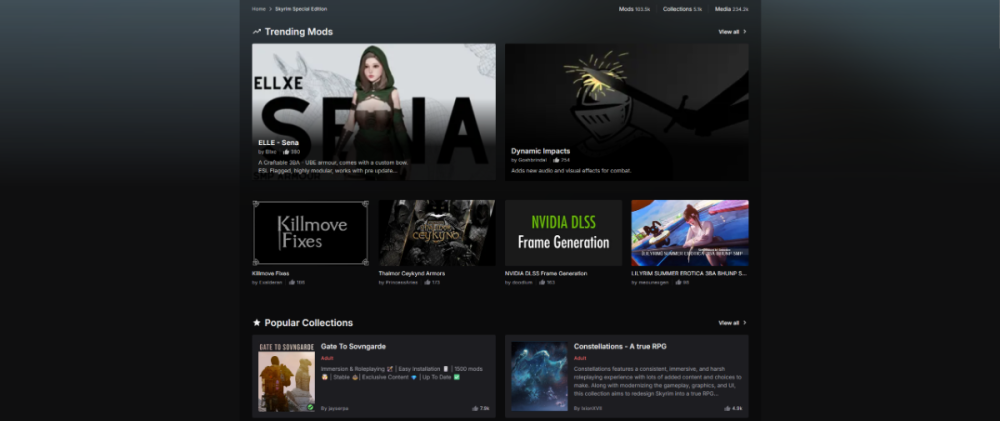
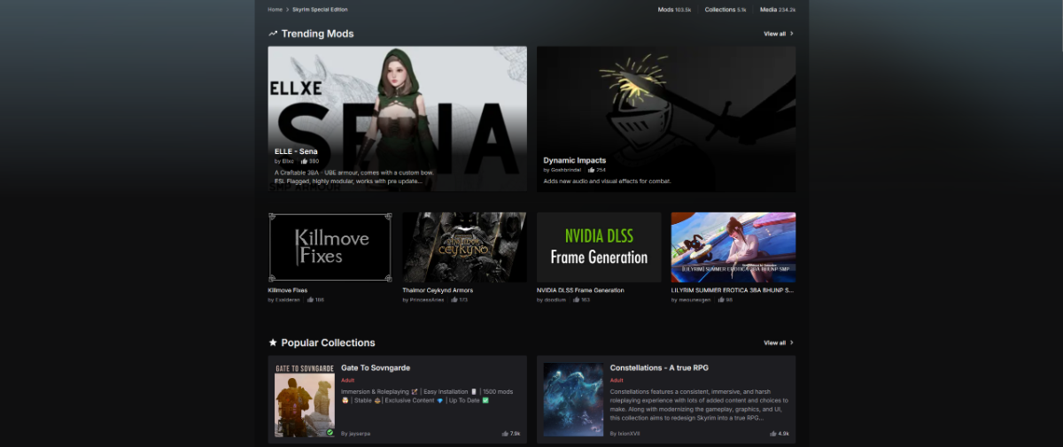
Holy mother of wasted space. The more compact layout of the original is fine. Showing a lot of information at once is not bad, for a mod page it is good.
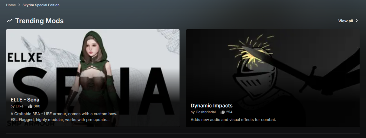
Remove the line and unneccesary information bits as shown in the image below and reduce the padding. A bit more tidier.
I do see how the stats on mods, collections etc... can be useful. Alternatively you can put that on the same line as the page tree.
In the original, the background image with the content having a solid background guides where to look on the screen and makes it easier to read. The new design feels "too open" if that makes sense? Too much unused space.
These small changes alone helps quite a bit if you guys are hellbent on sticking to this.
I would prefer that you guys stop with the wacky background stuff you are trying to do, keep it simple with the backgrounds like you are doing in the normal version.