


WndMll
-
Posts
5 -
Joined
-
Last visited
About WndMll

WndMll's Achievements
")
Rookie (2/14)
41
Reputation
-
Google, how do I kiss someone through the internet?
-
Not comparable but I see what you're getting at.
-
Now that I've seen that all hope is lost, let's just hope there will be someone out there willing and annoyed enough to make a browser extension or a tampermonkey script that fixes it.
- 646 replies
-
- 11
-

-
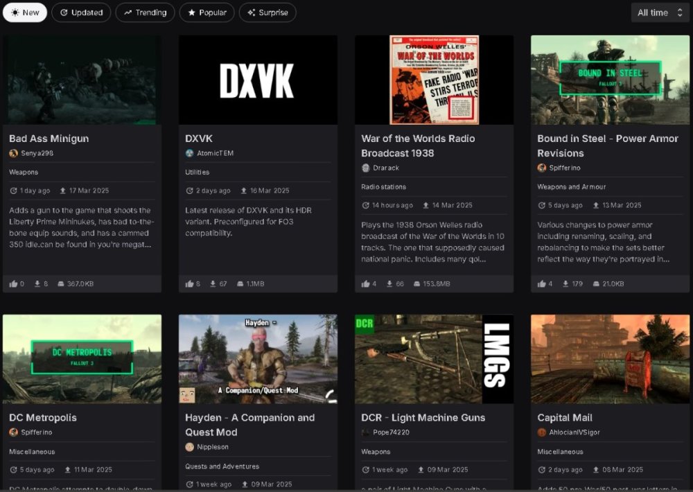
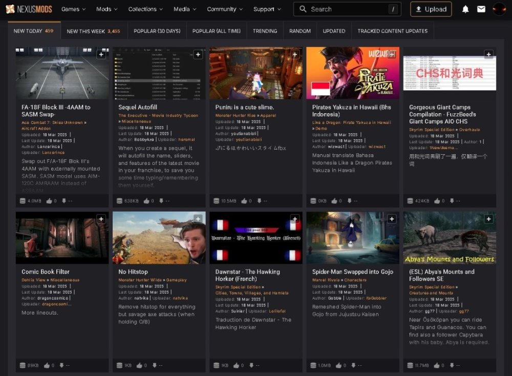
Four that don't even fit on screen compared to TEN that do fit on screen perfectly, the gaps between the panels on the new one as more than double the original. Original top bar is far sleeker than the bevelled oval buttons which look less compact therefore chunkier by comparison. The background now being darker only makes these issues more obvious and your eyes far more drawn to them. The lack of the orange text which tells you the categories doesn't help either, as it drew eyes in towards what they were meant to look at. When browsing under the explorer the tiles were horizontal, thus allowing more space for text to fit in and telling you more about it (I presume the text length was longer as it appeared that way). I wanted to give genuine criticism as to why it looks the way to does, why we don't like it and explain the smaller things that're incredibly important that haven't been mentioned. I simply don't want to see my favourite modding site, really the only modding site (besides gamebanana) turn into a mess. This should've been run by more people, specifically designers and broadened the test audience. The original look is slim and sleek while this new one is chunky and girthy and not in the fun way. Edit: Just wanted to mention, this is not the case of "We like the old because it's what we had and we just don't like change." I remember what Nexus looked like in 2014 and I guess what we'll now be calling 2024 nexus (I don't remember when that redesign came out) was actually a DIRECT update and I do not think a single person disagrees with that. Also the background images helped a lot and weren't intrusive nor did they guide eyes away, it added much need colour.
- 646 replies
-
- 13
-
-
First time I've ever used the forums as far as I can remember just to say that this redesign is awful. Wasted space, soulless and devoid of colour, despite wasted space everything looks overly large and the spacing between everything doesn't help as I like to see more things on screen not less. Like I don't want to sound mean but it's pretty vomit worthy just to look at, give us the option to revert or undo this entirely. Clearly more people don't like it than people that do like it.
- 646 replies
-
- 12
-

