InvictusVivus
-
Posts
6 -
Joined
-
Last visited
About InvictusVivus

Recent Profile Visitors
173 profile views

InvictusVivus's Achievements
")
Rookie (2/14)
8
Reputation
-
User Profile and Direct Messaging Improvements Beta
InvictusVivus replied to JustThatKing's topic in Site Updates
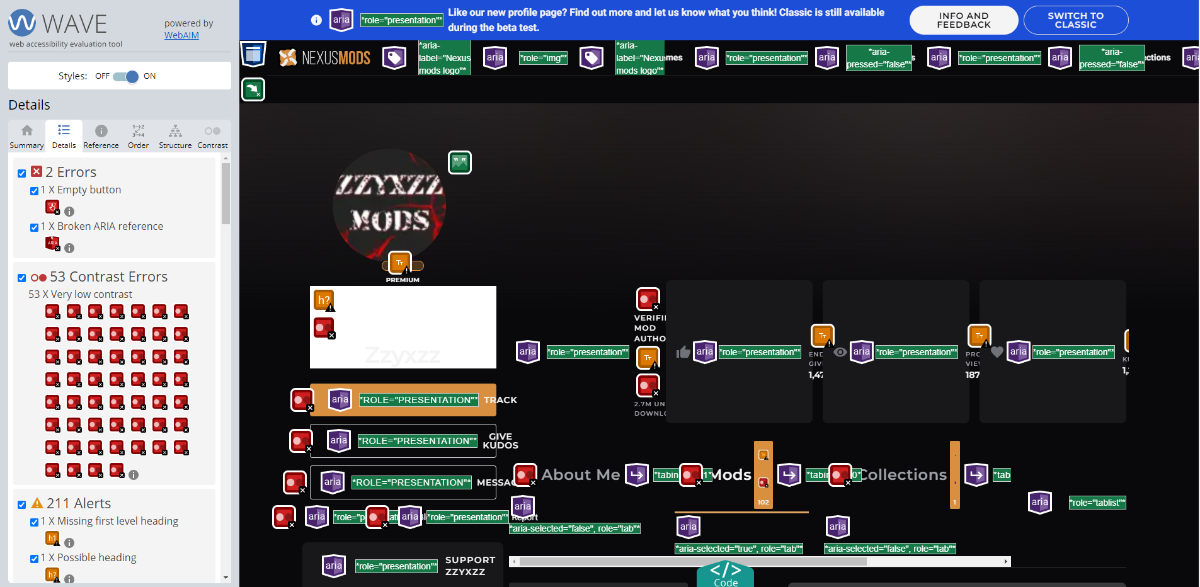
That's good to know I didn't take the time to look that deep my bad there I just assumed it was correct because I thought the contrast was a little off my bad on that. -
User Profile and Direct Messaging Improvements Beta
InvictusVivus replied to JustThatKing's topic in Site Updates
I'm going to be honest overlooking the several bugs I found this is generally a much worse design. Major points I have an issue with. 1. If we are looking at their profile why do we need to see their image on every mod? I know these cards are used elsewhere but you should be able to build in the togge for their profile image. 2. you went from 5 across to 3 across as a user that is really annoying. I work in web development and one of the things I would make sure you ask yourself is this making me scroll more? If so its almost always a bad idea same with requiring aditional clicks. 3. you shrunk the amount of space given for the description this is actually vital information for people. Taking away that info makes is more annoying to know if I'm intersted in the mod. 4. You increased the font size on the mods name I really don't think that neccesary WCAG does not have a minimum font size but you have major accesiblity issues with your color choices. I know this seems nitpicky but the company I work has been sued in the past for not taking accesiblity seriously. We are in the US though so it may be different for you. It also is worth noting here that taking the time to make sure colors are accesibile makes the page easier to read for all users not just those with vision imparments. (I know the current page has over 800 but still these are easy things for devs to fix that make a huge difference).