Khaalis
-
Posts
22 -
Joined
-
Last visited
Everything posted by Khaalis
-
Just as an FYI, a lot of people don't go to the site's Main Page. Some of us are here for modding a single game and that's what we come to look at. I'm on here almost daily and I haven't looked at anything but mod pages in over a year. If you're going to put up a banner for all users to read, it should load on every page, not just the home page.
- 2137 replies
-
- 11
-

-

-
I've been telling this to people for days. STOP grousing about the change. It will change nothing. This decision was made long ago (at least a year if not more) and set into concrete the minute they started putting $$$ into the development. Whether we like it or not doesn't matter. The changes are here and the best we can hope for is enough pressure on specific topics to get small changes made to improve the hot mess we have. I do UX/UI design for apps as part of my job and trust me, you can't get blood from a stone. If some senior "web designer" or 'managerial type' says "This is the way we want the design" regardless of what the UX/UI specialists tell them, you're going to end up with a bad design.
-
Ah but that requires double the inve$tment...
-
I believe, don't quote me on this, but I assume there is a lot of traffic generated via mobile when browsing and looking up info for the games/mods, especially that generated by things like YouTube videos, social media posting, etc. Now add to that that it is harder to simply block ads on mobile which is good for the site. --> $$$
-
So since @Demorphic has been asking for specifics: [Edit: PS.. I do UX/UI work for my job, so I can give more feedback if required.] Here is my first pass quick summary on the Search functionality. I will state right off that I much preferred the old quick search functionality. That said ... You kept the graphic of the Quick Search bar, but totally changed its functionality. It isn't a search bar anymore. Period. Thus there is no need for a Full Bar graphic. The Bar now functions as a Button. Thus this graphic should be changed to reflect its current function and be a Button, the same style as the Upload Button. Otherwise its misleading and just going to continue generating complaints. Search opens a Popup. In and of itself, this isn't a horrible choice. However, with that said, you can't actually do anything IN said popup. As soon as you select a returned item, click on View All, or click on a Recent Search, etc. it takes you OUT of the popup and loads a new page in place of where you started from. Many find this very annoying. SOLUTION: If you're going to force a Popup Window then either a) Keep all interactions within the popup IN the popup; b) Instead of a Popup, Open a new Search Tab; c) If you keep the Popup as is, make any New Page it generates open in a new Tab by default rather than overwriting your current starting page, or forcing you to specifically tell it to open in a new tab. {EDIT to above point} - Another HUGE annoyance with the current functionality is that you lose your Search every time you interact with something in the Popup. If you want to check a mod then come back to the search to check another, you can't because you have to start all over. Within the popup - Mods should be the default starting tab. I am sure you can check your own site's metrics and I would be willing to bet that at Least 80% of all searches done on the site are for mods. The Popup Window should be Dynamically sized to take up more than 60% of the available screen space. The returns in the popup suffer the same issues as on the main pages. Limited to 4 tiles. Too much excess space between tiles. There is little to no contrast between the background color of the PopUp window versus the colors of the tiles. Grey text on Grey Background is just a horrible design choice. Within the popup for Mods - I feel way too much space is given to the graphics. The graphics take up roughly 85-90% of the tile. These returns would be far more useful with smaller thumbnails (similar to what was used in the old quick search) and more focus on the text. I also feel the mouse-over amplification of the images unnecessary. Within the Popup for Mods - The details line should be more useful. You should at the very least add the number of downloads to the data line rather than just author and endorsements. People are lazy and don't endorse mods nearly as often as they just download them and move on, so seeing downloads can tell you more than endorsements. Adding Date Last Updated would also be a HUGE benefit. In the same tile, the Mod Name should be more prominent, increased font size at least double that of the data line. The data line also needs better contrasting color. Examples: As is ... Should be more like:

- 2137 replies
-
- 19
-
-
-

-
Thanks I got it figured out. I was erasing Everything and trying to paste in your code when what I needed to do was just delete/paste over only the @-moz-document section and leave in the first 7 lines of header info.
-
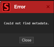
I'm new to Stylus but I am getting this error when I try entering the code you posted.
-
Request for reversion or even an option to switch style is a moot point. They aren't listening. We're getting the changes whether we like them or not. That decision was set in stone as soon as they put development $$$ into the "upgrade". The best we can do is beg for Improvements to the new site to make it at least a bit more palatable. That or do what some are doing and using something to Stylus to "mod" it ourselves.
-
Care to share the code changes?
-
When you say you made changes, can you give us more details on the what and how? I'm currently using the Stylus changes LummoxJR put out, but its no where near as comprehensive as your changes shown here.
-
Thank you for this! You need a solid way to let everyone know when you have updates to the mod of the mods!
-
Are the designers even listening anymore? I get the distinct impression they don't really care what we think.
-
Definitely have to agree with most of the posts in disliking the changes I see today. It looks like an attempt to be exactly like Mod.io, which IMHO is a crappy site design. I hate the mod.io layout. The old (from yesterday) design here was great. If its not broken, don't fix it. No one asked for these changes. PS: To add, the one thing I HATE the most is the changes to the Tracked markers for Downloaded/Update Available. They are hard to spot, especially the 'Downloaded' just being a check mark. Also the White background does not pop nearly enough. The old Orange banner markers were far better. The cards are also poorly spaced and take up far more space then they need. PSS: After looking at this some more, as UI/UX designer all I can say is ROLL IT BACK. Listen to your users and don't force changes no one wants.
- 2137 replies
-
- 20
-
-
-
I tried to make an amulet with Enlarge on it but for the life of me can't get the mod working.
-
Hi all. I was hoping to find someone that would make an item that grants the wearer the Enlarge-Reduce spell. Failing that, does anyone have some good resources on how to make your first mod? Why? For a new play through, I want to try and do a form of Goliath/Half-Giant type using the Enlarge Spell for the size. However, it appears that this spell doesn't really get much love. Thanks.
-
I'd love to help with testing but with 187 mods and still just getting ready to enter Act 2 for the first time, I'm not sure I want to risk hosing my saved game.
-
As far as applied mods, you'll want to get a list from someone experiencing the issue with only a few mods. I personally am running 187 mods, so I'd never expect anyone to test by replication of the list. That said, I know that some of the people having this issue have stated they are only running a handful of mods. Also, to add, I have experienced this issue from day one of installing Vortex. As an aside, the only issue I had "creep up" after it had been working is the auto download from the website. It used to be I could click on the 'Slow Download' link from the webpage and it would automatically start the download in Vortex. That stopped a while ago. I now have to go to that download page, copy the URL and paste it in the "Click to enter URL" link at the bottom of the Downloads tab. Another thing that never worked was the "Drop File(s)" section at the bottom of the Mods tab. The only thing that works is the "Install From File" button on the top toolbar.
-
Vortex 1.9.5 LSLib 1.18.6 (downloaded the day it became available) Still having load order issues. Had to restart Vortex 8 times today to do 1 mod update.
-
It is my understanding that Fixers are no longer required. The core game supports mods now.without need for a Mod Fixer mod. I run with mods and removed mod fixer before Update 2, but I can't remember what hotfix it was that brought native support. EDIT: Actually I believe it Update 1 that made them obsolete.
-
Thanks for the update and heads up. Glad this will be looked at. This issue has almost got me to the point of dropping Vortex and just using BG3 Manager. PS: If there is anything that I (we) can do to help, let me (us) know.
-
What kind of information do you need? Are there log files that would help? Honestly, it's as simple as: 1) Open Vortex (normally or elevated) 2) Click on 'Load Order' 3) When it completes the compile, roughly 75% of the time it chooses to randomly pick anywhere from 1 to about 6 mods to "lock". 4) Close Vortex 5) Repeat steps 1-3 until it returns a clean "all unlocked" list. Close Vortex and don't touch it again until you need to update, change, load mods again. Examples: Opened it and Load Order attempt 1 ... Attempt 2 ... Attempt 3 ... Attempt 4 finally got me a clean list. I deal with this EVERY time I make a change in Vortex. I've had to 'Load Order' as many as a 12 times before I got a clean list.
-
I have the exact same issue and have since I started using the manager. It can take me 20 or more tries to get a Load Order that doesn't have at least 1 randomly locked mod. It is INCREDIBLY frustrating!! This should be a HIGH PRIORITY bug. Either stop it from locking all together or give us the option to unlock them manually.