


Synthlight
-
Posts
14 -
Joined
-
Last visited
Everything posted by Synthlight
-
I still fail to see how that argument means replacing the UI for DESKTOP users. Mobile can, and rightfully should, have it's own UI/UX, designed specifically for it. Not some singular UI made for both. That just winds up being s#*! for everyone. So if mobile is being used as an excuse for the redesign on desktop.... that's just the wrong way of designing for mobile. (And I say this as a mobile (Android) dev.) Edit: And to elaborate, many of the design changes on DESKTOP seem to be mobile focused: - Bigger UI elements, less mods visible, each one is larger, etc. - Lots and lots more padding between the elements, almost like you're trying to make it easier to tap or something. - Very vertically oriented designed for scrolling on a portrait screen, not a landscape one. All very much signs the DESKTOP UI has be mobilified in a bad way. (Since all of those are generally a net negative for DESKTOP users.)
- 2138 replies
-
- 11
-

-

-
100% this. you don't make one design to fit both. That just winds up being a shitty experience for everyone.
- 2138 replies
-
- 10
-
-
I made a userscript to get rid of the godawful waste of space that is the "Popular Collections" section: (Because I fully expect any feedback on the section to be "This is how it is now, get used to it.") Edit: Setup a repo for these with a before/after image: https://github.com/Synthlight/Nexus-Design-Fixes // ==UserScript== // @name Nuke "Popular Collections" on Nexus game pages. // @namespace http://tampermonkey.net/ // @version 1.0 // @description Remove the godawful waste of space that is the "Popular Collections" section from Nexus game's root page. (Because I've zero expectations that anyone in charge of design will ever actually act on feedback like this.) // @author LordGregory // @match https://www.nexusmods.com/* // @grant none // ==/UserScript== function getElementByXpath(path) { return document.evaluate(path, document, null, XPathResult.FIRST_ORDERED_NODE_TYPE, null).singleNodeValue; } (function() { getElementByXpath("//section[@aria-labelledby=\"popular-collections-header\"]").remove(); })(); And one to remove the game header that wastes space at the top: // ==UserScript== // @name Nuke the Game Header on Nexus game pages. // @namespace http://tampermonkey.net/ // @version 1.0 // @description Remove the godawful waste of space that is the game header section from Nexus game's root page. (Because I've zero expectations that anyone in charge of design will ever actually act on feedback like this.) // @author LordGregory // @match https://www.nexusmods.com/* // @grant none // ==/UserScript== function getElementByXpath(path) { return document.evaluate(path, document, null, XPathResult.FIRST_ORDERED_NODE_TYPE, null).singleNodeValue; } (function() { getElementByXpath("//div[./nav[@aria-label=\"Breadcrumb navigation\"]]").remove(); })(); Edit: And, yup, what I expected to happen actually happened: Got a suggestion on changing some part of the new design? Well, too bad. It'll just be denied/ignored. Get used to the new design, it's here to stay.
- 2138 replies
-
- 11
-
-
Correction: You can yell into the void but it'll change nothing. May people, me included, complained about how much space the new design wastes, and yet, it looks no different from the beta.
-
HOW DO I GET RID OF THE GIANT "POPULAR COLLECTIONS" THING THAT WAISTS SO MUCH SPACE. Why was that pushed. It's so obnoxious. I DON'T USE VORTEX. I want the space back for things I actually use. New layout just waists so much space on a game's root page. The compact layout that was there previously was so much better.
- 2138 replies
-
- 16
-
-
I'm really not a fan of all the wasted space it has. Other than that it seems OK. On a game's root page, you now have: The game header which isn't really needed and pushes everything down an inch or two. A "popular collections" thing which I want turned off completely since I don't use collections (or Vortex). And just a general large amount of spacing between the sections. There's too much spacing. I want to be able to see the top/trending/hot/whatever you wanna call it section, as well as the 'new' section (aka 'more mods') below it without having to scroll down.
-
Looking at collections, I don't see this behaving any differently, and that doesn't really change my suggestion. If you need a 'clear filters' button put it elsewhere; the "selected game" button would be so much better if the to were merged as I mentioned. (And don't get me started on collections... I'm never there because they are useless to me. You can't create them in anything EXCEPT via vortex, an app I don't use, so I can't make them for users, nor is it possible to DL one except via vortex which I don't use so.... I'm never there.) As for the "user profiles" part.... again, I see absolutely no difference. It looks like the exact same menu across the top of the screen. What do you mean by "you'll see how it's actually intended to work"? It seems to be no different, and I see nothing there that changes my suggestion. When I first saw the 'X', I honestly thought it was going to remove it as a favorite. Not clear a filter. Older system was better. Things lost from the older system I want back: - Bigger icons. - The ability to see the whole game name, not a tiny part of it. - Very easy at-a-glance identification of where the drop down was. If people can't tell they're looking at results for a specific game and that they can change that and go to a different game.... Don't cater to idiots. PS: If by 'consistency' you mean the other sections having the game menu.... I'm not saying get rid of that altogether. I'm only saying replace the 'game' menu with the merged entry WHEN a game is selected. If one isn't, the 'game' button/menu would fill the same space. PPS: If a 'clear filter' options is that needed.... why can't it be in the drop down instead? PPPS: If you truly need the 'X' button, maybe put it on the left side of the game entry and the merged drop down button on the right?
-
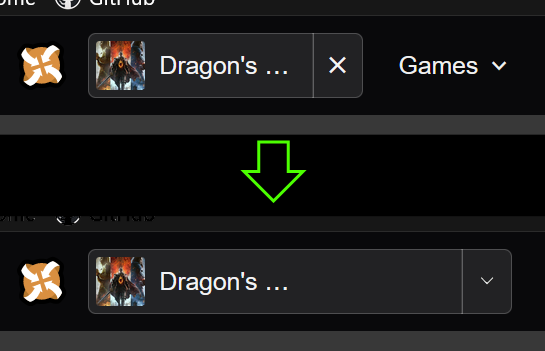
This was mentioned in an earlier message, but it's also my biggest issue with it. The "X" button is... annoying and unneeded. If you want to go to the site root (which you usually don't) you can click the logo next to it. It would be much better to merge it with the games drop down so there's extra space to show the full name. Here's what I mean: (A not so great mockup but you get the point.) The two don't need to be separate. Merge them and: - There's more space for the title. - The unneeded 'X' button is now a drop down button and opens what the 'games' button does now. - There now 'one' button/space for games and not two separate buttons. - If you really need a 'close' button, put it in the drop down? As for the drop down itself, I really don't like how small the icons are now. The previous horizontal row with large icons was much easier to use and nicer to look at. There's so much dead space on the current one. Maybe go back to the horizontal layout with two or three rows?
-
My goal is to be able to have my bow appear on my back with my sword equipped & drawn (and vice verca). Whats the best way to go about this? Would it require altering the .nif? I've made mods before (mostly scripting) but never any modeling or anything like that. I don't really know where to begin here. PS: I've made an attempt or two with SkyEdit but it ended in miserable failure. :(
