hmmnorah
-
Posts
4 -
Joined
-
Last visited
About hmmnorah

hmmnorah's Achievements
")
Newbie (1/14)
8
Reputation
-
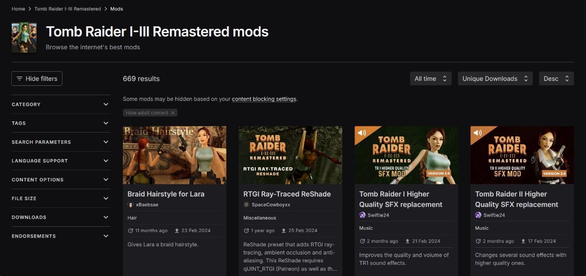
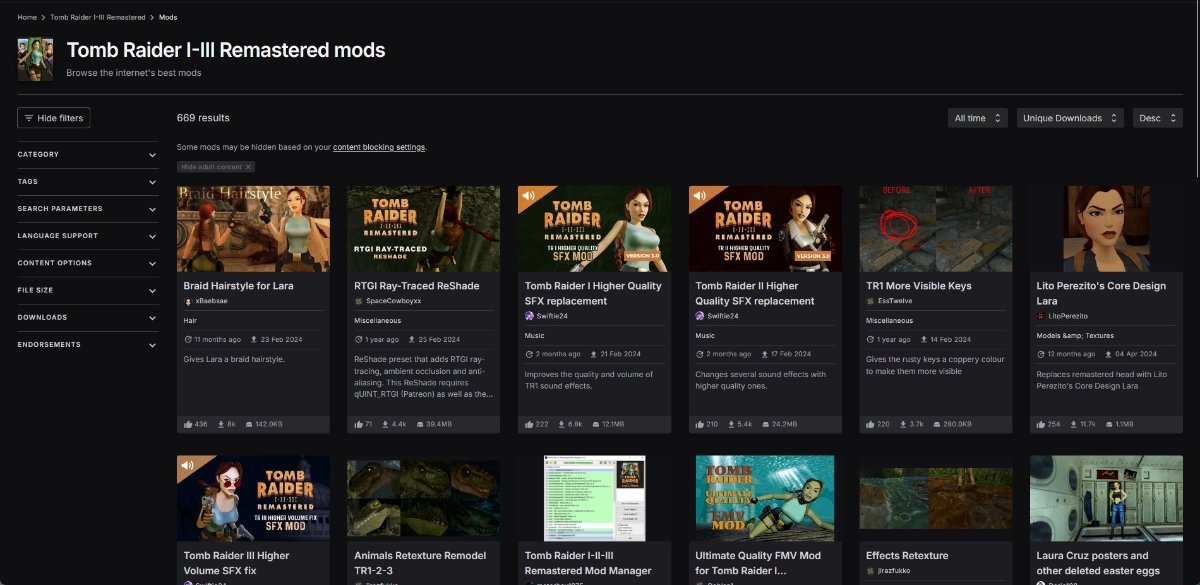
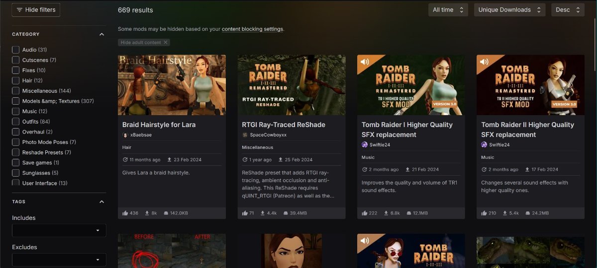
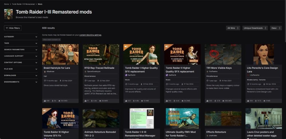
Shrinking the webpage down demonstrates how bloated it is at 100%. 60% is a bit too small for me (I have Keratoconus), but 70% is a step in the right direction. I also removed the blurred background because I do not care for blur, my bad eyes do that already. The card entry of each mod is way too tall. I don't want there to only be photos, but at the same time something should be done to compress how much space the text entry takes up. For example, I really don't think that the mod author and category need their own bespoke lines with an empty line of padding above and below

-
Count me as one more person that hates the new UI. Why does a 1080p window only show four mod listings now. Why does a 1440p window only show eight? This redesign is a usability decline, I feel like I'm drowning now.