pilonexyz
-
Posts
8 -
Joined
-
Last visited
Everything posted by pilonexyz
-
Thanks for explanation. I already made some tweaks from your excellent CSS code and found solutions to suit my personal taste. Personally i think 2 rows title is too much for overall cleanliness. Mod authors should stop to make it so long. Adding 5 rows of description should help you understand enough what is the mod about. Hope you don't mind i modified some of your work and credited your original source. Edit: I'm experimenting adding a code line to show full 2 or 3 rows title only when hovering on it. It works and might be a solution.
-
Glad you like it
-
I'm terribly sorry, there was a bad formatting with the previous CSS code. Here's the correct one: https://pixeldrain.com/u/a13JRcUf
-
This is the modified CSS code, will try to publish also on https://userstyles.world Please note i'm not a professional and i'm with very basic CSS knowledge and i tried to do my best. You can get the code here: https://pixeldrain.com/u/a13JRcUf
-
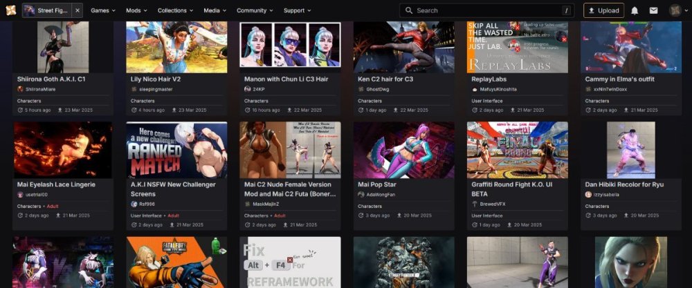
Tried to replicate the old UI feel with Stylus extension on Firefox using LummoxJR template as a base. Adjusted the horizontal spacing between images, made the title text to be on 1 row only and put back the orange. This is what i got:

-
This solved most of the problems i had, thanks a lot. Now i have 3 rows with 6 results on screen at 1080p hiding the mod description. What bothers me is no matter you shrink, each page is limited at 20 total results. Also if mod title can be restricted to 1 row of text no matter how long is it would be perfect.
-
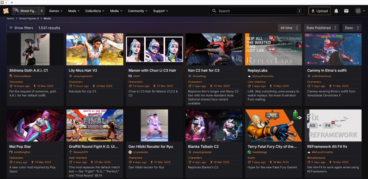
The New UI is hideous, at least on PC. Looks like a mobile adapted with gigantic images and tiny font words. At least give us opportunity to choose between old and new in profile preferences. Why change the previous one? That was perfect.