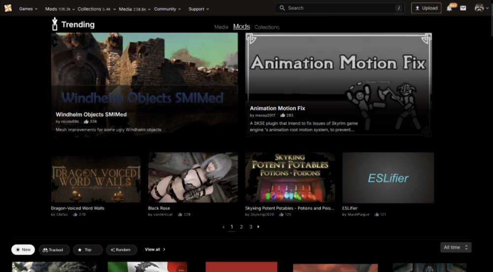
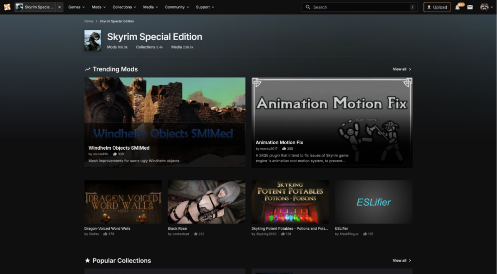
Clearer section names to reduce confusion.
Removed redundant “Trending” tab in the lower section — it's already a large section on the homepage and accessible via its own link.
Top can be sorted by recent (last X days), making a separate “Trending” tab unnecessary.
“Tracked” is now a filter — no more sorting through every mod ever with Updated. Use “Tracked” to view updates from your download history, making tracking actually useful.
The bottom 4 mods in the Trending section now scroll dynamically in three groups — keeps the page from feeling static.
Increased mod grid from 4 to 5 mods per row — better use of screen space.
Dark mode UI with improved contrast and reduced visual clutter.
Flattened header/nav bar for cleaner navigation, moving the stats with them.
Removed the unnecessary double links everywhere that are right next to each other.
I'm not sure if the game's name is super necessary, but I thought it looked cleaner without it. Plus, your tab already says the name. It can easily be added. You can also use an icon because people aren't dumb!
More space for showing off mods, there isn't more useless space than mods without feeling cramped.
Collections and media are given a space to have trending, but shouldn't be the default.
The three "View-all"s are removed since you can click the name.


.png.1845c9498389e9f82a8c1563d37a9c4c.png)
")