StarRiseShine
-
Posts
9 -
Joined
-
Last visited
About StarRiseShine

StarRiseShine's Achievements
")
Rookie (2/14)
10
Reputation
-
Oh no! I didn't even notice this in the mess of the front page. Even non mod authors use tracked mods to check for replies to questions (since the notifications are very unreliable), but this is very bad for mod authors. Please fix this Nexus folks.
-
Nexus is always pretty hard to use (no light mode, comment search gone, then back, then gone, filtering tags not always useful) but wow, I've never needed to take the size of my screen down. I usually use 125% on my browser (yes, I need new glasses), but I have it set to 80% now just for Nexus. Please, let us have better options for the main screen. Smaller pics for all categories, (light mode, please), more mods across a row, options remove whichever part we don't care to see. I love Jayserpa, but I don't need to see collections every time. Trending mods doesn't need to take up 100% of above the fold real estate. If you're trying to cater to mobile folks, I get it, but shouldn't you be designing to various screen sizes responsively? It feels mobile first and mobile only.
-
User Profile and Direct Messaging Improvements Beta
StarRiseShine replied to JustThatKing's topic in Site Updates
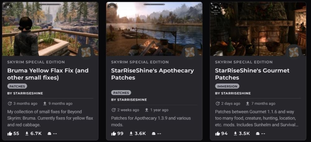
Just want to add in my support of increasing the number of cards across and decreasing the gigantic left column. I also agree that last uploaded should be default and we need those downloaded flags back. There's some very weird spacing going on between the title and the category, even with cards that have the same number of lines (Pic attached below - the middle one has a random extra space below the title.) I do like the larger font, and honestly, I'd love a white or light background option as well. Thanks for all your work!