CaptainSandyPants
-
Posts
14 -
Joined
-
Last visited
1 Follower

About CaptainSandyPants

CaptainSandyPants's Achievements
")
Rookie (2/14)
7
Reputation
-
Are you referring to the orange coloured links for categories?
-
Here's the latest with reducing the contrast on the areas that have been brought to our attention. If you're currently experiencing discomfort, let me know if the below is more comfortable for you. To clarify, this only covers improvements for those that find the contrast too high. It doesn't cover feedback on the layout which we are looking at separately:

-
It's something we're looking at, along with potentially other layout types to give more choice.
-
Yeah it's a shame, I love when I see a rare shop window that you can tell someone has hand painted. Ha good point on the "EW" thing, you're the first to raise that. Red is an interesting one, in the west we generally avoid it on the web as it usually denotes "danger" (although there are exceptions), but in India it symbolises "purity" with it being the traditional colour of wedding dresses, and in China it's strongly associated with "Luck".
-
So that class .text-neutral-subdued is a variable in our design system, if you change the color value for that it will change all text we set to what we call our subdued foreground colour, subdued refers to the level of contrast with our background (surface) colours. If you see .text-neutral-strong this would be the text that has a higher contrast to our surface colours. This might be useful information for anyone wanting to make their own CSS mixes.
-
I can see how, as a sign writer, that'd drive you mad (my grandad was a sign writer), so apologies for that! It's a stylistic choice to create bit of visual interest and energy on those thumbnails. I'll pass this feedback on to the team though. Glad you're enjoying the purple.
-
Glad you like. Should be even more pleasant now as we've toned down the higher contrast white/greys down there too
-
We do use variables which makes it easier for us to address the root problem so the site is inherently accessible for all from the start. If there are any areas you are currently having issues with in terms of contrast, let me know and we'll see what we can do.
-
I understand, if I remember correctly there was a user with visual impairments involved in the discussion who found the higher contrast helpful, which makes balancing different accessibility needs tricky. That's why were still open to feedback, we want to make it right for as many people as we can. We can reduce the contrast significantly in the areas we've managed to nail down as problematic while still maintaining the AA WCAG rating. It just may require a bit of back and forth.
-
No not at all, I referenced your feedback to show that we do listen and make changes based on what people raise, and we're keen to do that again here. I completely understand that "better" doesn’t always mean "best", if there are still issues that need to be addressed, we’re happy to take that feedback into account from yourself and others.
-
Is this the label that appears on mod tiles for mods you've downloaded in the past and now have a new version available? If so I believe that's already on the list to look into, but I'll double check and add it if not.
-
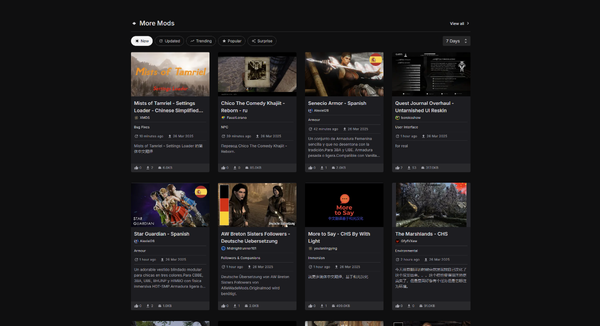
That's fair enough. We're reaching out to others who are experiencing discomfort with the high contrast too. So far we've narrowed it down to the "chips" i.e. the tabs for Mods, Updated, Trending, Popular etc. on the site and the potentially the headings above those. If there's anywhere else you, or others here, find the colours harsh please let me know specifically where they are. The team are also looking into the other feedback that's been raised but I'm personally looking at reducing the high contrast at the moment, while maintaining our AA rating for those with visual impairments.
-
The last we spoke about contrast on the forums you ended with "yes the forums are/should be a lot more tolerable for people complaining about the high contrast/eye strain. Aka, I'd be able to stand down on my complaints directed at the forums. With this editor, should help with eye strain immensely for those complaining" this was based on the changes we actively made based on your feedback. We haven't changed anything since then, that said, if you have have found that there are more/different issues you are having after spending some more time on the forums, I'll be glad to look into them. We don't want anyone to experience discomfort when viewing the site.
-
Thanks for feeding back on the example screenshot with the reduced contrast. The reduction in contrast in that example was for us to get a baseline of what the absolute max could be an not cause eye fatigue, which even then we would then use sparingly and aim for lower in general while still maintaining at least a AA rating with WCAG. I'll share an example with a further reduced contrast soon which it would be great to get further feedback on.