SCARaw
-
Posts
50 -
Joined
-
Last visited
About SCARaw

Recent Profile Visitors
42834 profile views


SCARaw's Achievements
")


-
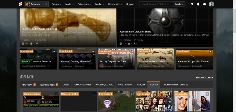
This is how it looks for me 2 Hot mods take entire page aka 30% of whole website and 50% of visible space "more mods" which usually i sort by recently updated to check something interesting are all crammed together and take around 20% of whole website and 50% visible space now lets compare it to this ugly and outdated classic you hate so much im not sure how to even articulate my points here when i use nexus i wanna find cool mods to use in my game you made it show less mods and make the presented mods look worse

-
Thank you guys, i wasn't sure if its new or old, but i tout its worth mentioning since it might improve experience with the site
-
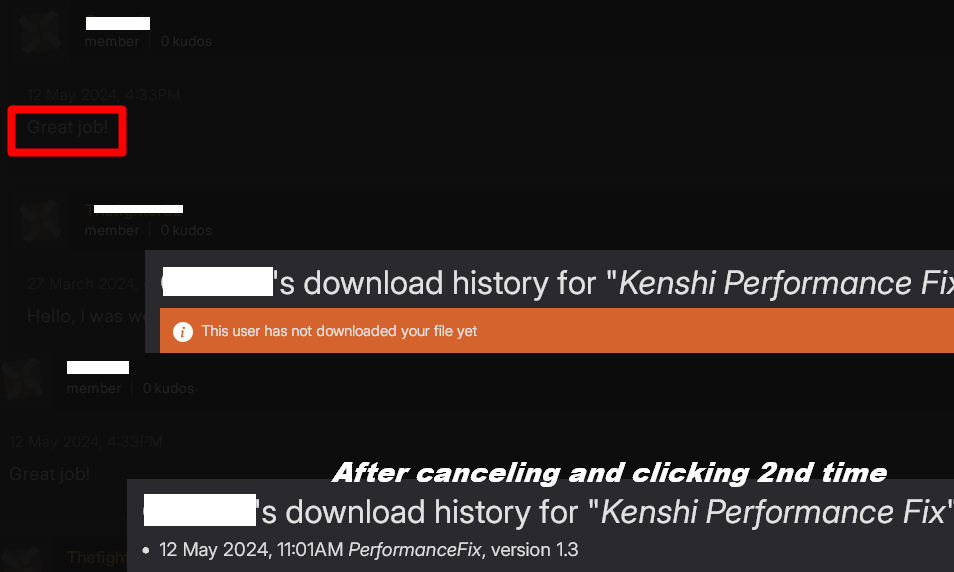
i found one more design flaw and stupid bugs So for some reasons you must click "download history" cancel it, do a coffee and click download history again to show actual download history of the user...sounds very stupid, i wonder why you designed it this way? xD Also this DIM effect for POP-UP window is TOO BLACK (im very proud for not inserting jokes here)
-
i found new nitpick to bother you about MEDIA TAB under my image when i go to manage i have only 1 option Add 2nd option - Hide image / make public to make it more intuitive? Basically why i can't just EDIT after clicking manage?? if thats the only option?????? either add more option or let people edit from manage

-
Hey, i just wanted to say that i m impressed by new design of the pages Complains about mod page:

-
awesome
-
i see how it is hit me with longer and longer posts so i can't properly comprehend what was posted in the 1st place TLDR: they will allow you to patch paid mod with optional file My opinion: f*#@ it, make better non-paid mod and even try to submit it to bethesda for half of the price of the paid mod that made you angry enough to pull it off in the 1st place while keeping nexus free exact version intact
-
Bethesdrons want to piggyback of their establish nexus reputation with paid mods i hope backlinks are worth it, if my predictions are correct nexus should be way more attractive for bethesda loyal cashcows than bethesda market is for nexus users as for inZOI it feels like AI generated website to push the point...i can not see any content there at all i wonder who registered domain in anyways im glad you are not just bending backwards to few greedy modders, Nexus can provide better experience for the users and creators and im sick of seeing people selling away they creativity to corporate mods
-
Can not start up to the main menu of FNV without NVAC
SCARaw replied to Matrimelee's topic in Fallout New Vegas's Discussion
hey, if im not too late to help i would suggest reinstalling the game completely get some NVSE and all this funky engine fixes don't use anti-crash - i prob need to find source https://vivanewvegas.moddinglinked.com/avoid-mods.html -
User Profile and Direct Messaging Improvements Beta
SCARaw replied to JustThatKing's topic in Site Updates
WAIT A MOMENT this space behind my avatar? it will be /CUSTOM BANNER? -
User Profile and Direct Messaging Improvements Beta
SCARaw replied to JustThatKing's topic in Site Updates
i can't complain very cool!
-
User Profile and Direct Messaging Improvements Beta
SCARaw replied to JustThatKing's topic in Site Updates
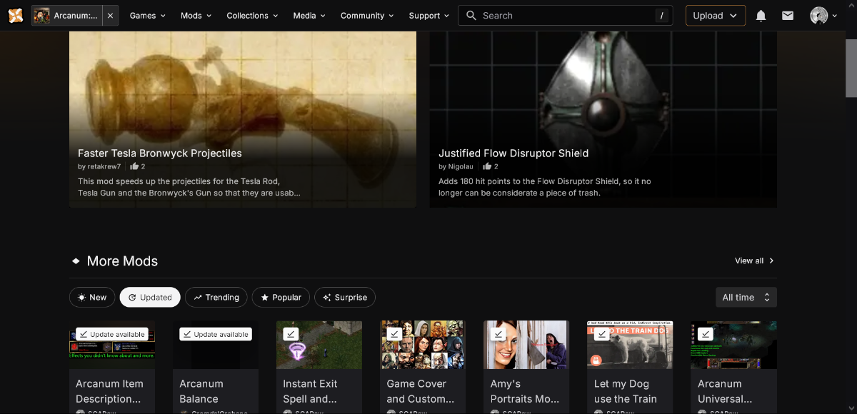
Hey i just wanted to say that now browsing mods is definitely fine (i m still bias toward seeing 10 mods at once vs 4 and 4 halves) however i will not stop bitching about: recently updated in mod sorting options i wanna know what my dude been working on, not what new mod he added recently
-
User Profile and Direct Messaging Improvements Beta
SCARaw replied to JustThatKing's topic in Site Updates
i just came to tell that on top of all the past issues: Media tab currently have nothing on it i believe its temporary, but prefer to mention just in case good luck with that -
User Profile and Direct Messaging Improvements Beta
SCARaw replied to JustThatKing's topic in Site Updates
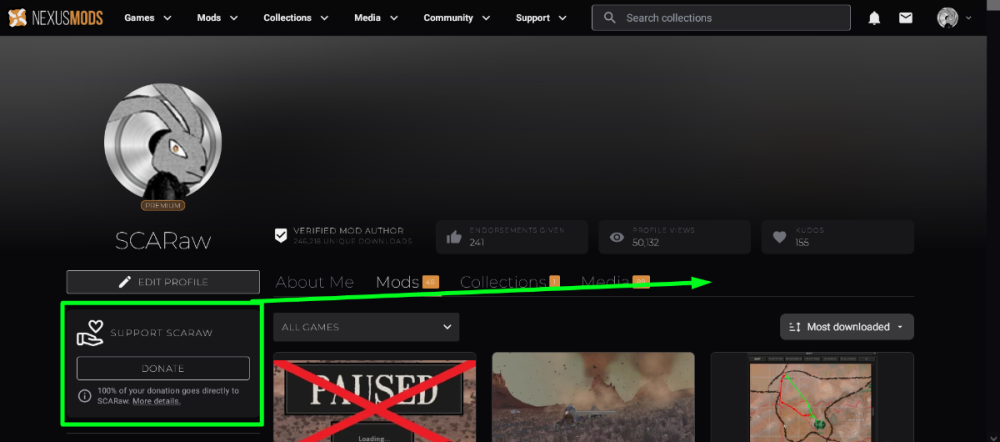
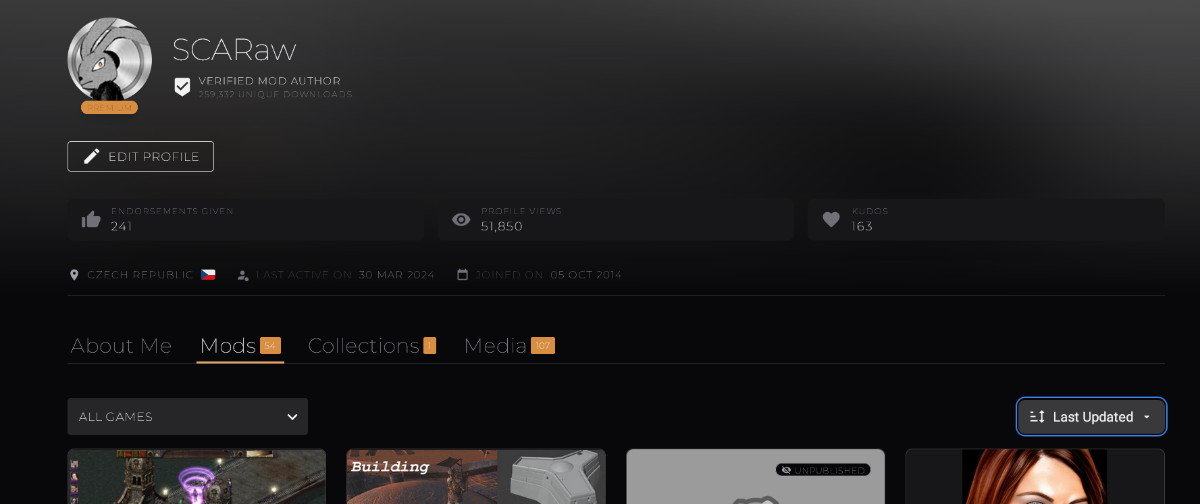
Last updated should be priority when i browse person's profile (you might say its subjective, but nah man, if you wanna work with this guy kyanu reves or whatever you prob wanna know what he been up to recently) you should also strive to display more mods on profile and also Pages > infinite scroll bar i do my cardio on jogging, i don't wanna scroll nexus page so much to find anything there is a lot of wrist related issues that intense use of computer might cause and you are not doing anybody any favors by having such scroll nightmare in place and also this: You should match this Verified author button with other buttons you might also wanna reinvent WHITE color for font Grey on dark grey, might sound like good idea until you trying to read anything
-
User Profile and Direct Messaging Improvements Beta
SCARaw replied to JustThatKing's topic in Site Updates
i think i found reasonable solution: By moving donation button here on top and making profile static you could squize 4th row of mods into the page it would solve 2 problems at once: page would display more mods, but not as many as before...but hey and my avatar will not follow STALK people as they browse my mods following them everywhere with DONATE button i do love small Avatar pics on top of the mods, but moving avatar is too much