


N3rdGirl64
-
Posts
5 -
Joined
-
Last visited
About N3rdGirl64

Recent Profile Visitors
975 profile views

N3rdGirl64's Achievements
")
Newbie (1/14)
6
Reputation
-
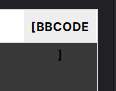
So uhh the block for the [BBCODE] overlaps into the comment box on the mod pages...
-
Thank you, I would also like to share some changes that I think could be made to make things look nicer but are just nitpicks on my end XD I think the buttons could be set to have a color change when hovering over them, especially if they are gonna be this color on all pages I think a lightening or turning an orange when hovered over would be a nice contrasting color. The orange color I am referencing is the one on the "Submit Reply" button for the forums. I think it would provide enough of a contrast. Really any sort of change to the buttons would help to make sure that we know that they are being highlighted and is a chance to be able to show off a bit more pizzazz with the new look. Reminder, these are nitpicks of my own, mostly going off of what I learned in school when it came to website design. Thank you for coming to my TED talk


-
Addendum to this...I hate the new search menu...When I ctrl click to open in a new tab the WHOLE thing just goes away...I don't like that...
-
Can't seem to get the surveys to pop up for me so I would just like to say that I like the new design for the games page, It fills out more nicely and has way less wasted space on the margins. For the game home page I also like it, I like that more of the page is filled and that the links are smaller and up at the top for mods, collections and media. I also like how there's more of a showcase for collections. and then finally for the mod listing page I LOVE the categories on the sides. Makes it much nicer in my opinion.

