Draco856 Posted December 16, 2011 Share Posted December 16, 2011 First, the tongue is blocking some of the runes on the blade. Then the face seems a bit, I don't know, blocky, like instead of being painstakingly carved, it was simply pressed into existence if that makes any sense. It might just be the way the pattern looks, with the breaks in-between. Something a bit closer to number 3 in your drawings seems to look better from my perspective. More angular, less of a rounded feel. Link to comment Share on other sites More sharing options...
buddah Posted December 16, 2011 Share Posted December 16, 2011 That looks very good my old friend. Link to comment Share on other sites More sharing options...
PrometheusTS Posted December 16, 2011 Author Share Posted December 16, 2011 (edited) Jeah, that looks nice. Me myself i would just add something to the area on the right..crossover scales and the plain area, but this can be solved with textures, would make em to look more organic and to round the sharp shapes as well. Is this zBrush or Mudbox? zBrush i guess...Thanyou the plain area is still to be worked this is a preliminary test to see the overall look of the carvings and how woudl pop out ...I am using 3dsmax / zbrush First, the tongue is blocking some of the runes on the blade. Then the face seems a bit, I don't know, blocky, like instead of being painstakingly carved, it was simply pressed into existence if that makes any sense. It might just be the way the pattern looks, with the breaks in-between. Something a bit closer to number 3 in your drawings seems to look better from my perspective. More angular, less of a rounded feel.Hehe yeh I know that is just a test the tongue I can and will give a wavy shape after so to accompany the words like if the same dragon was speaking , I just need to do a new knot work to accompany this up and down carving ... as for the pattern I do not like how ti come out sincerely , in effect I am not sure if to go with a more blocky Cut or a more curvaceous shape , the Idea was to mix those two styles : http://www.lore-and-saga.co.uk/assets/images/Stormy_Fiord_300w.jpg http://swordswap.files.wordpress.com/2010/11/af1_2_l.jpg but somehow I failed and it ended in a Aztec Mayan feel ... That looks very good my old friend. Thanks a lot :) .... Edited December 16, 2011 by PROMETHEUS_ts Link to comment Share on other sites More sharing options...
PrometheusTS Posted December 17, 2011 Author Share Posted December 17, 2011 Update on the hilt deco ... how 's like that? http://img72.imageshack.us/img72/8871/updatesword.jpg Link to comment Share on other sites More sharing options...
Draco856 Posted December 17, 2011 Share Posted December 17, 2011 I like it, but for some reason I'm still getting that Aztec/Mayan feel to it. It just looks like carvings from them because of the way the blocks look. But that's probably just me. No matter how the final product turns out, it still looks great. Link to comment Share on other sites More sharing options...
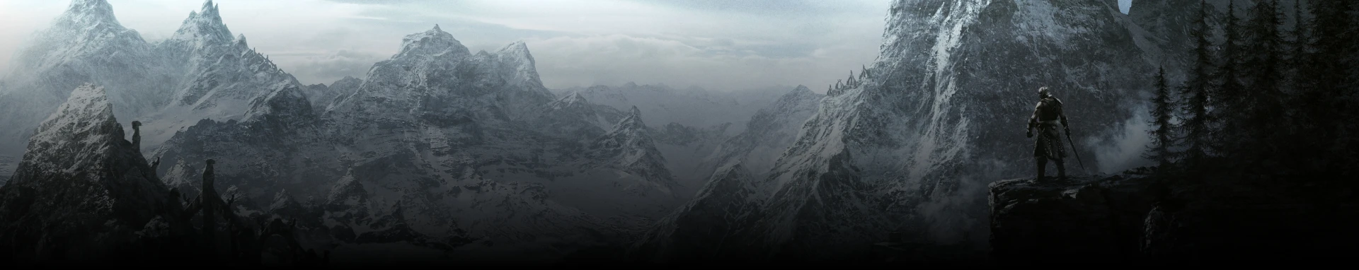
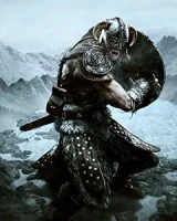
PrometheusTS Posted December 17, 2011 Author Share Posted December 17, 2011 what do you mean? I used patterns of Viking Celtic knot works this time , the Mayan Aztec look more like that : http://www.cooltattoofinder.com/wp-content/uploads/2010/01/aztec-dragon-motif1.jpg http://www.ibreak4bacon.com/wp-content/uploads/2009/08/aztec1.jpg http://fc08.deviantart.net/fs15/f/2007/106/9/5/Aztec_circle_of_life_Dragon_by_bishonenlover.jpg ,ay be the blocky parts? the plaques? Link to comment Share on other sites More sharing options...
Draco856 Posted December 17, 2011 Share Posted December 17, 2011 Yeah, I'm talking about the blocky parts, it just gave me the feel of an Aztecian carving instead of a nordic one. But like I said, it's probably just me. Link to comment Share on other sites More sharing options...
PrometheusTS Posted December 17, 2011 Author Share Posted December 17, 2011 May be I could imprint a figure on each plaque and smooth the under ones ... Link to comment Share on other sites More sharing options...
Draco856 Posted December 17, 2011 Share Posted December 17, 2011 It's just my opinion. It's your design, Perhaps draw some inspiration from actual Norse art? Or even look at some of the carvings in-game and see how they look and draw inspiration from that. Link to comment Share on other sites More sharing options...
PrometheusTS Posted December 17, 2011 Author Share Posted December 17, 2011 (edited) What about this Deco type? with and without eye versions ... http://img545.imageshack.us/img545/9730/dragonsword1.jpg http://img23.imageshack.us/img23/2495/dragonsword3.jpg Edited December 17, 2011 by PROMETHEUS_ts Link to comment Share on other sites More sharing options...


Recommended Posts