HollownessDevoured
-
Posts
634 -
Joined
-
Days Won
9
Content Type
Profiles
Forums
Events
Everything posted by HollownessDevoured
-
User Profile and Direct Messaging Improvements Beta
HollownessDevoured replied to JustThatKing's topic in Site Updates
Just out of curiosity, is any custom colour schemes or personal CSS going to be made available for the new update? I see some people requesting day/night mode, or want less dark or like the different link colours for each game like the old version has. And are we getting a custom banner option? It just looks like we have banner space. -
A laid-back thread where everyone's welcome to drop their thoughts and join the banter about Dragon Age Origins, modding and Nexus.
-
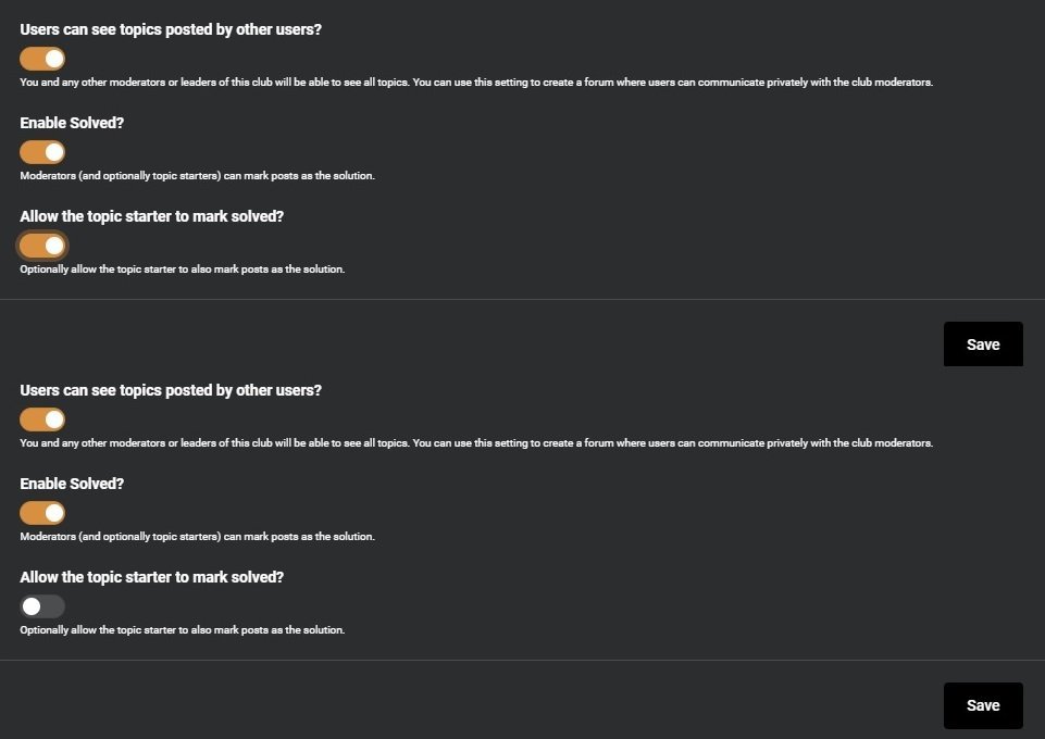
This toggle still won't save for my forums. Top is me enabling and saving, bottom is next time I open/edit the forum. I really want this enabled for the forums for Dragon Age Origins. Can this be fixed, or have staff enable? edit: unless I should just make myself a moderator? I apparently have the option.
-
Sorry, I did assume by copies, it meant a different file extension, since it is not the original, I should have been more clear. But yes, do not have the original name, use a file name extension to ABI_base.
-
This will be done via the ABI_base xls/gda file. Open the xls file find the talents and under prereqattribute change 2 to 1. Then to convert xls file to gda. If this is your first time editing xls source files (Dragon Age Ultimate Edition\tools\Source\2DA) be sure to copy the originals and edit the copies. Also only include the talents edited to avoid conflicts that you may have from other mods.
-
User Profile and Direct Messaging Improvements Beta
HollownessDevoured replied to JustThatKing's topic in Site Updates
Shrunk by 20% was better IMO. This was my fix sample with overall 20% size reduction. -
I don't mind the reactions because you can acknowledge a post without replying to it. Leaderboard is meh, so far it is populated with the people I react to most, because I react a lot, I guess. It really doesn't mean much IMO especially ATM, still early days, but "most posts" leaderboard is the same thing, so you reply a lot... But I think they removed badges (I don't think I have any) and replaced with this instead. If reputation was more a way to know if a person is more of a troll, rude (but not rude enough to report) or helpful at a glance, would be more helpful. Then you can avoid getting in arguments with those types of people.
-
User Profile and Direct Messaging Improvements Beta
HollownessDevoured replied to JustThatKing's topic in Site Updates
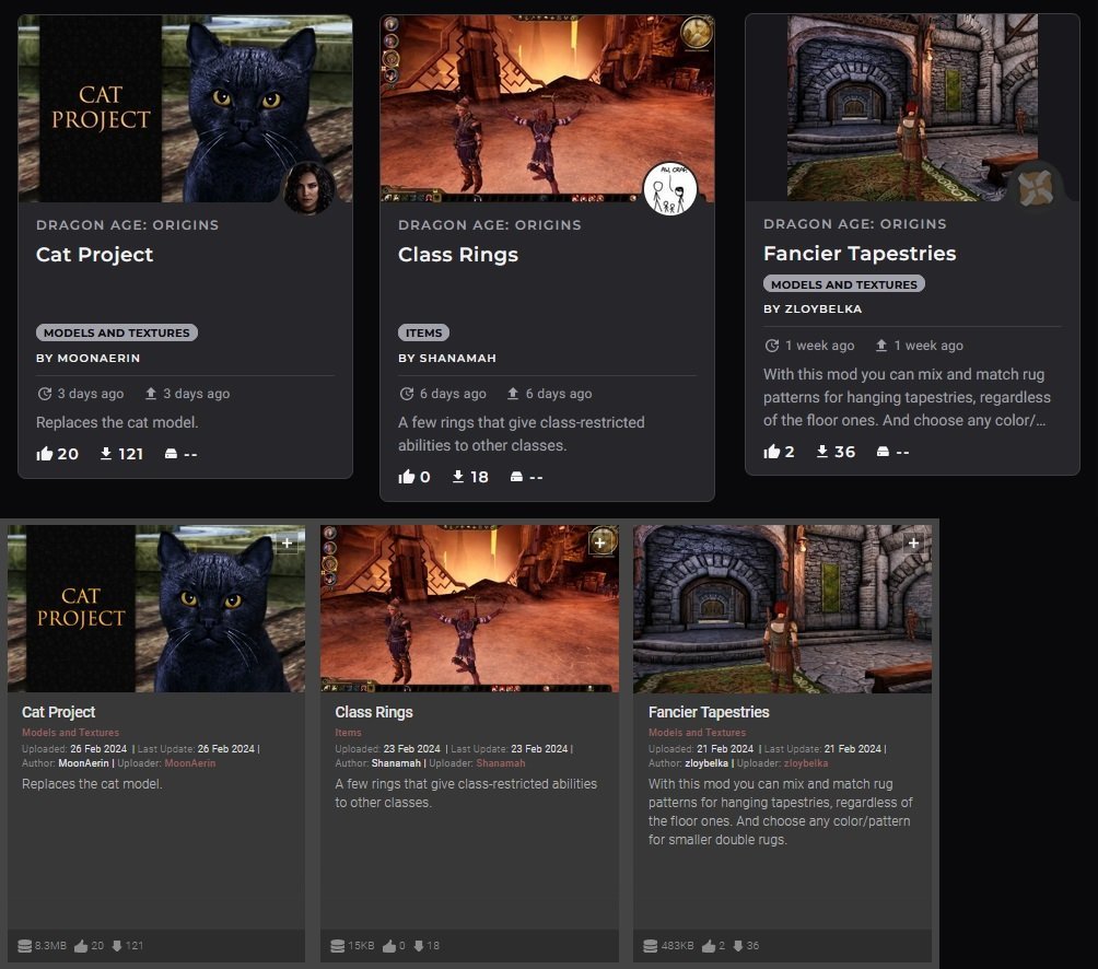
I thought I'd show a sample of why I think we have avatars on mods, I think it is for game pages and searches to look like this. But while gathering some samples I noticed sizing and spacing inconsistencies. This should be addressed: image should scale so no empty space, no rando gaps between file name and category, and no height differences.
-
User Profile and Direct Messaging Improvements Beta
HollownessDevoured replied to JustThatKing's topic in Site Updates
Another thumbnail preview image issue, but for media. Wide images get squished in beta but are not in classic.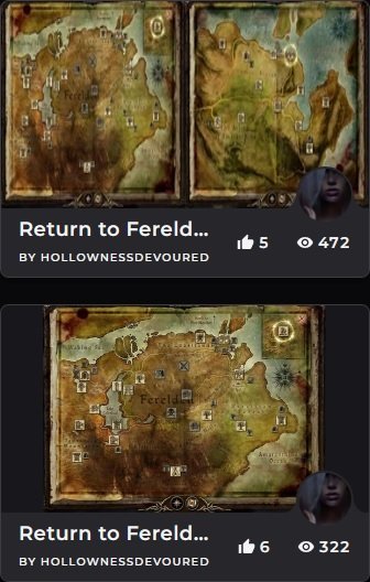
-
User Profile and Direct Messaging Improvements Beta
HollownessDevoured replied to JustThatKing's topic in Site Updates
nvm, reloaded and worked -
Glad it is sorted then
-
@LenaWolfBravil Since you and I seem to frequent the same topics and are actively responding, I think I would have seen you. I do look at who else is in the thread, I do not think I have seen your name ever listed. So might be some other buggy thing.
-
User Profile and Direct Messaging Improvements Beta
HollownessDevoured replied to JustThatKing's topic in Site Updates
Since it was not addressed yet (that I saw), I'll ask straight out with visual aide. Will primary mod images be rescaled properly? I see some people seem to have the correct dimensions and the extra space isn't there, but all my mods have this extra space in the beta, that do not on classic. Will this be corrected, or are we going to be told what dimensions are needed to not have the extra space?
-
User Profile and Direct Messaging Improvements Beta
HollownessDevoured replied to JustThatKing's topic in Site Updates
Another thing, though I do agree I think having the "downloaded/update available" tag on mods is helpful. I like not seeing it for my own mods. I once downloaded my own mod and regretted ever since, I hate seeing that tag on my own mods. But it is needed for other mods. I have suggested this but it was only ever for one's own mods. -
User Profile and Direct Messaging Improvements Beta
HollownessDevoured replied to JustThatKing's topic in Site Updates
Be sure to mention this for the new forum feedback thread too, I so far have been one of the few to voice about this X / -
User Profile and Direct Messaging Improvements Beta
HollownessDevoured replied to JustThatKing's topic in Site Updates
Well, I assume but I could be wrong, we might be able to upload a banner eventually too, hence why I left banner area still available. It does seem like the beta was going for looking cool instead of functionality and I do like a little of aesthetics, but I need functionally more since I am constantly on my mod pages/articles and when we had profiles: my profile. To update those details for hours with poor function, less than ideal UI and and too much extra space would/will make that painful for me. edit: but I prefer classic -
User Profile and Direct Messaging Improvements Beta
HollownessDevoured replied to JustThatKing's topic in Site Updates
https://feedback.nexusmods.com/posts/1630/return-about-me-content -
User Profile and Direct Messaging Improvements Beta
HollownessDevoured replied to JustThatKing's topic in Site Updates
Yes XD -
User Profile and Direct Messaging Improvements Beta
HollownessDevoured replied to JustThatKing's topic in Site Updates
Ok here is my "if I had 30 mins to make beta better" this would be it. Overall at 80% smaller Sort by recently added 3-5 mod view, scales size accordingly No left column for profile details/details in header Name scaled better for longer names Avatar scaled smaller edit: I left the avatars on the mods because I assume that is for when this theme is on game pages/search/etc. It might be nice seeing the avatar as well as mod image preview when searching through mods. edit, edit: I also left the header space open because I assume that is for an eventual banner. edit, edit, edit: I didn't have time for this sample but I'd also like if the thumbnails scaled properly, as classic does. I mean do I have to reupload all primary pictures? That would suck.
-
User Profile and Direct Messaging Improvements Beta
HollownessDevoured replied to JustThatKing's topic in Site Updates
@SonicTHI You just made me feel my age LOL. Thanks for the link/read. I have similar worries as you do too. I really hope they do not let us down because profiles will set the tone for mod pages, articles, etc. -
User Profile and Direct Messaging Improvements Beta
HollownessDevoured replied to JustThatKing's topic in Site Updates
As a fellow long named user this^ We need this for the forums too X / -
User Profile and Direct Messaging Improvements Beta
HollownessDevoured replied to JustThatKing's topic in Site Updates
I collapsed/closed the beta banner. Is there a way I can see/get this again? -
User Profile and Direct Messaging Improvements Beta
HollownessDevoured replied to JustThatKing's topic in Site Updates
I agree, I just read classic way more easily (both in text and formatting) and not the beta. Edit: and this is not to invalidate those who like the beta format, I mean it does have a cool look as far as quick take looks wise. But do you extensively read guides/wikis/etc. online or are you a youtube guide watcher and comment/thread only reader? This formatting seems more geared at those not extensively reading and viewing pages for long term. I am reading, and typing out detailed descriptions for my mods (via mod description tab or articles), I am looking at text and formatting sometimes for hours on Nexus (or before Nexus wikis/wikia/fandom like over 50k edits for the past 15 years), I could barely look at the beta for 2mins without having to leave the page. -
User Profile and Direct Messaging Improvements Beta
HollownessDevoured replied to JustThatKing's topic in Site Updates
I have noticed that various staff do seem to show activity "out of hours". Not just on weekdays sometimes weekends and it is appreciated, however, it is a genuine fear for many users (what puddlepond pointed out). And this change has me very worried (even if it is prematurely) especially how mod description tabs and articles are going to look too. I don't want fancy, I need something that someone can read lots of details (I make very in depth mods and articles) without oversized sections and wasted space. -
User Profile and Direct Messaging Improvements Beta
HollownessDevoured replied to JustThatKing's topic in Site Updates
Oh, gawd, I really hope this isn't the case but I have been hurt before.